Paradoxically, even though there are many ways to prioritize your work, many people and organizations fail to do so. Here are my top 6 prioritization methods that can be used for private activities as well as business topics such as product development.
What is a prioritization method?
For me, it’s anything and everything that helps you to
- get your activities in the proper order,
- based on objective criteria,
- efficiently and practically.
“Activities” is a broad term, and I use it purposefully. You can use these methods for small tasks or bigger endeavors in your private life or for prioritizing your (product) backlog at work.
Here are my top 6 prioritization methods for you.
If you prefer watching over reading, check the video below.
ABCDE Method
Quick Summary
Brian Tracy popularized this method for prioritizing tasks in his book “Eat That Frog“. It is based on the principle of collecting all your tasks and then categorizing them into five groups and subgroups if needed.
It works best for clearly defined tasks and cannot easily be used for larger activities. While it can be used by individuals and teams, it is a bit cumbersome for the latter.
In terms of “result clarity” (i.e., the outcome of your planning session), I rank it the highest among these methods because you really get a distinct priority for each and every task on your list.
The ABCDE method is very easy to understand and apply, even if you have never heard of it before.
The Priority Buckets
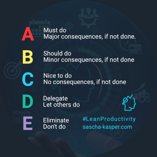
- A – Must do – major consequences, if not done – these are the “frogs” to eat
- If you have more than one “A” task (or frog), you prioritize them further inside the group with A1, A2, etc. This makes A1 the first frog on the menu.
- B – Should do – minor consequences, if not done
- C – Nice to do – no consequences, if not done
- D – Delegate – Let others do
- E – Eliminate – Don’t do
- Easy to understand
- Low planning effort
- Works great for individuals
- Results in granular priorities for your tasks
- Not suited for larger endeavors
- Not a great approach for teams
Eisenhower Matrix
Quick Summary
The 2×2 Eisenhower Matrix helps you to group your tasks into four quadrants depending on the task’s urgency and importance, respectively. Note that urgency trumps importance!
The logic for grouping tasks is as follows:
- Urgent AND Important: Do now
- Important but NOT urgent: Decide (schedule a time to do it)
- Urgent but NOT important: Delegate (who can do it for you?)
- NEITHER urgent NOR important: Delete (eliminate it)
This is probably one of the best-known – and most popular – methods for prioritizing individual tasks.
I use it myself quite a lot.
My concern with this approach is that – if applied strictly – it does not allow for non-productive activities (e.g., watching TV or playing games).
Hence, I renamed “delete” to “delay”. That way, I can still indulge in relaxing – but non-productive – activities without messing up my priorities.
- Easy to understand
- Low planning effort
- Works great for individuals
- Not suited for larger endeavors
- Not the best approach for teams
- Results only in priority groups; details need to be done in a second step
- Eliminates perceived timewasters, which everybody needs to indulge in occasionally
Feasibility, Desirability, Viability Scorecard
Quick Summary
Essentially, the Feasibility, Desirability, Viability (FDV) Scorecard uses a simple “unweighted sum” method to rank items.
The total sum per item is derived from the values assigned to each of the three criteria:
- Feasibility
- Can it be done?
- Do we have the expertise and means to do it?
- Desirability
- How much do we – or our users – want it?
- What’s the unique value?
- Are there other ways to fulfill the need?
- Viability
- Is it beneficial (for us or our business)?
- What are the related costs over time?
How to Use
Typically, you would use a table for this approach. Create one column per criterion and a total column at the end. Then you add one line for each of your items (e.g., features). Last not least, rate each criterion for each item on a scale from 1 to 10. Do not use the same criterion rating for multiple items (i.e., you should not have the same value in any given column).
Once you are done, sort the items by the total sum in descending order, and you will have your prioritized list.
As you may have noticed, this is not something you would do alone for your individual task list. Indeed, the FDV Scorecard is a great tool for teams, trying to prioritize features.
Two quick notes:
- You can rename and even add columns to the scorecard.
- If you have to consider multiple criteria, check this more advanced version for Multi-Criteria Decision Making.
- (Fairly) easy to understand
- Works great for teams
- Works great for larger activities (e.g., features)
- Results in clear priorities
- Not suited for individual tasks
- Items might end up with the same total sum, requiring further prioritization
- High planning effort - not something to do on a daily basis
Impact-Effort Matrix
Quick Summary
In some ways, the Impact-Effort Matrix is the mirror image of the Eisenhower Matrix.
They have some parallels – most notably that they are both 2×2 matrices – but also significant differences. While the Eisenhower Matrix works very well for individuals and small(ish) tasks, the Impact-Effort Matrix shines when used by teams and for prioritizing larger activities.
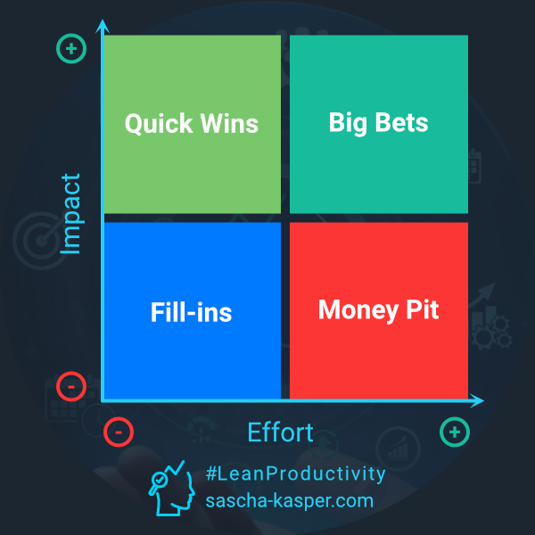
Once again, you place these activities into one of four quadrants along an axis for effort (X-axis) and impact (Y-axis).
Each activity will end up in one of these quadrants:
- LOW effort and HIGH impact: Quick Wins: pursue those!
- HIGH effort and HIGH impact: Big Bets: plan and prototype
- HIGH effort and LOW impact: Money Pit: nope, don’t go there
- LOW effort and LOW impact: Fill-ins: easy to do but might not be worth even that little effort
- Easy to understand
- Works great for teams
- Good approach for larger activities
- Not suited for small tasks
- Bit of an "overkill" for individuals
- Results only in priority groups; details need to be done in a second step
MoSCoW Analysis
Quick Summary
Here is another method that helps you to group your activities into four buckets. This time, it is not done with the help of a matrix, though. Instead, team members vote per item.
And yes, this is mostly for teams and mostly for prioritizing features and functionalities to be built in a project.
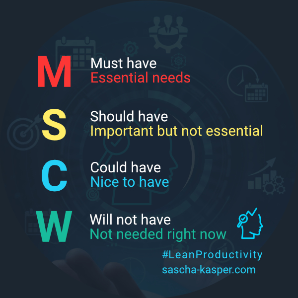
MoSCoW stands for
- Must Have: the project cannot do without them
- Should Have: must-haves in the long run
- Could Have: low-cost tweaking
- Won’t Have: Get back to them at better days – or never
How to Use
You start by listing all your features or functionalities and then let all team members vote on them. This is often – and most easily – done with the “dot-voting” technique. Then you simply cluster the features in the defined groups, and you are all set for your next project, program increment, or sprint – yep, this method is commonly used in agile software development.
- Easy to understand
- Low planning effort
- Works great for teams
- Good for projects, program increments, sprints
- Not suited for small tasks
- Not the best approach for individuals
- Rather specific to software development
RICE Method
Quick Summary
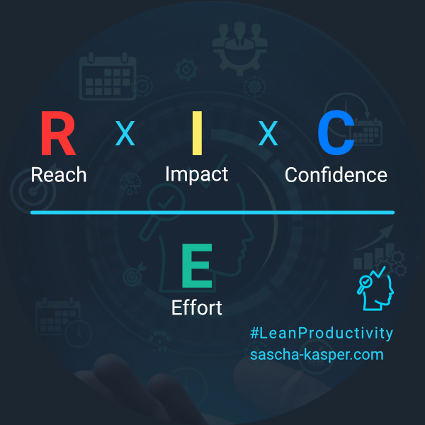
Last not least, let’s take a look at RICE. Yes, another acronym. This one stands for
- Reach: # of people affected
- Impact: value added
- 3 – massive
- 2 – high
- 1 – medium
- 0.5 – low
- 0.25 – minimal
- Confidence: in your plan and abilities
- 100% – high
- 80% – medium
- 50% – low
- < 50% – veeeery long shot
- Effort: work, time, and money needed
How to Use
You rate each item on your list according to these four criteria to get your priorities. Then, multiply the values for Reach, Impact, and Confidence and divide the product by the value for Effort.
It sounds complicated because it is – initially.
If you have been working with agile methodologies, you might be familiar with the “Weighted Shortest Job First (WSJF)” method, which is very similar to RICE.
Usually, the first question is, “how should I know all these values per criterion for each item on my list?”
In an ideal world, you get those from analytics, usage metrics, client surveys, or similar sources. I don’t know about you, but I usually don’t operate in an ideal world. The good news is that RICE and WSJF work perfectly well without precise data. You can work with the relatively rough scales above for choosing a value.
A Quick Example
- Reach: 200,000 users per month with a conversion rate of 20% -> 40,000
- Impact: 1-medium (see the scale above)
- Confidence: 80%-medium (see the scale above)
- Effort: 12 person-months
Result: (40000 x 1 x 80%) / 12 = 2,667
Do this for each item, sort them by their score and start with the highest-ranked one.
- Very thorough basis for priorities
- Little risk of setting the wrong priorities
- Works great for technically oriented teams
- Can be used by individuals, too
- Not suited for small tasks
- High preparation effort
Top 6 Prioritization Methods - Infographic
Having said all that, how do these methods compare? Take a look at the infographic below. I rated each method for:
Flexibility
- Suitability for small(ish) tasks
- Suitability for large(er) activities
- Usable for individuals
- Usable for teams
Result Clarity
- a detailed list
- prioritized groups only
Ease of Use
- the required effort to understand and apply the method
I gave a score from 1 (worst) to 10 (best) for each of these criteria. In the end, I calculated the average for an Overall Score.

Disclosure: Some of the links in this article may be affiliate links, which can provide compensation to me at no cost to you. These are products I have used and stand behind.


